
Revamping Reviews
Problem Statement: How might we encourage a casual reviewer to leave a review for a business on Yelp.
Responsibilities: I served as the Design Lead and Sprint Master.
Step 1: Understand
The first phase of this project was to take a step back and fully understand what problem we were trying to solve for our users. To do so, I lead some UX research on the status quo review writing experience.
I conducted qualitative usability tests asking questions about why and how users currently write reviews on Yelp and other platforms. From the research, my team gained insights for what paint points in the current flow exist.
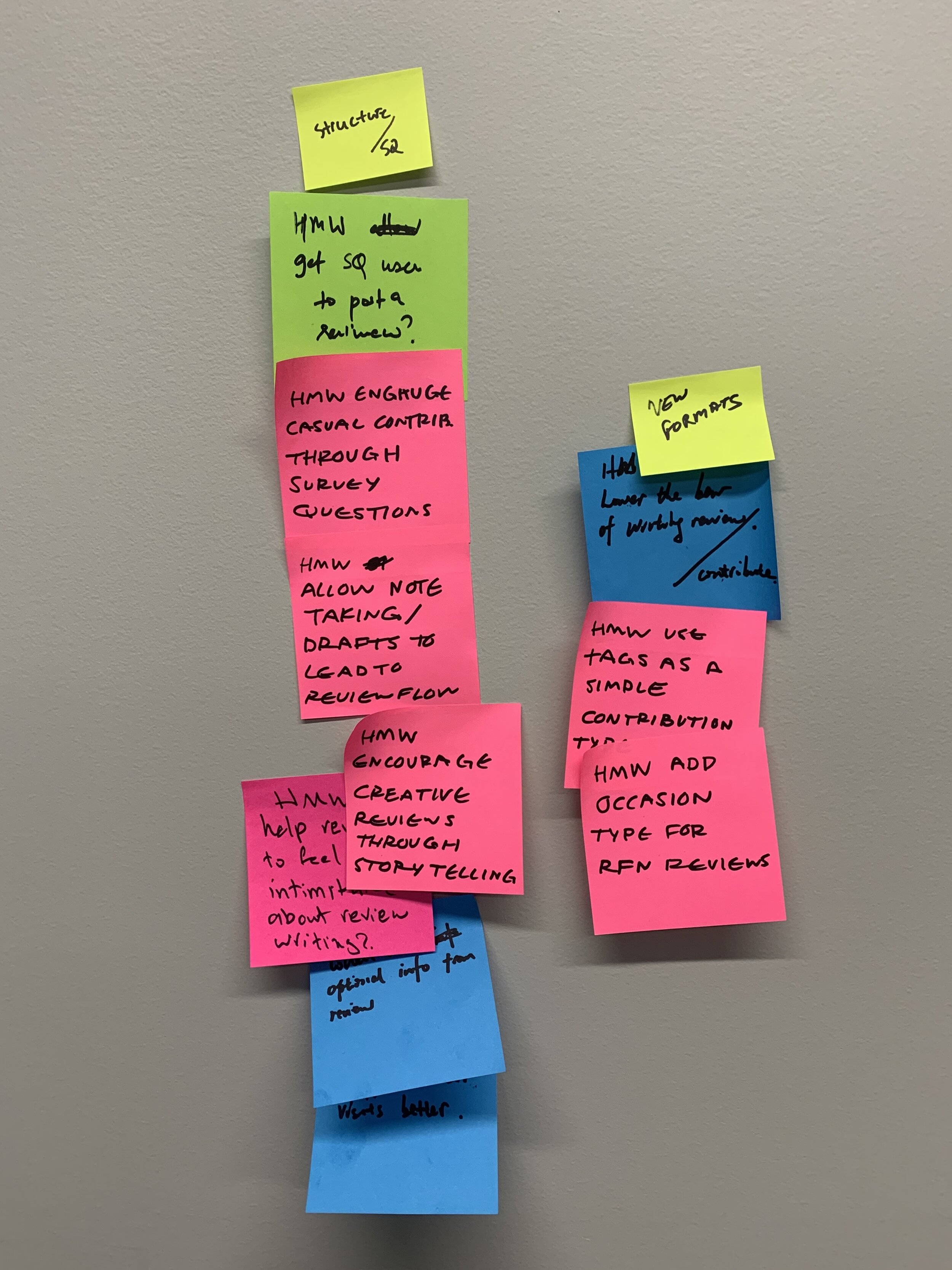
User Pain Points
From conducting the user research, there were some high-level takeaways as well as pain points that informed the direction my team and I pursued. These main pain points were:
Low contributors were still motivated to review if they thought that the business deserved it but they don’t feel very motivated.
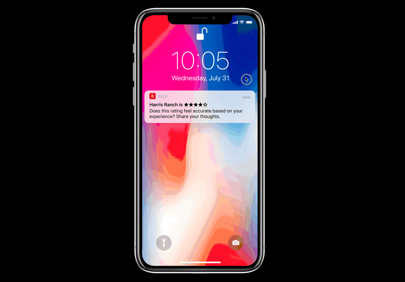
Participants were intimidated to write a review because of the time it takes and the high quality of other reviews.


Step 2. Diverge
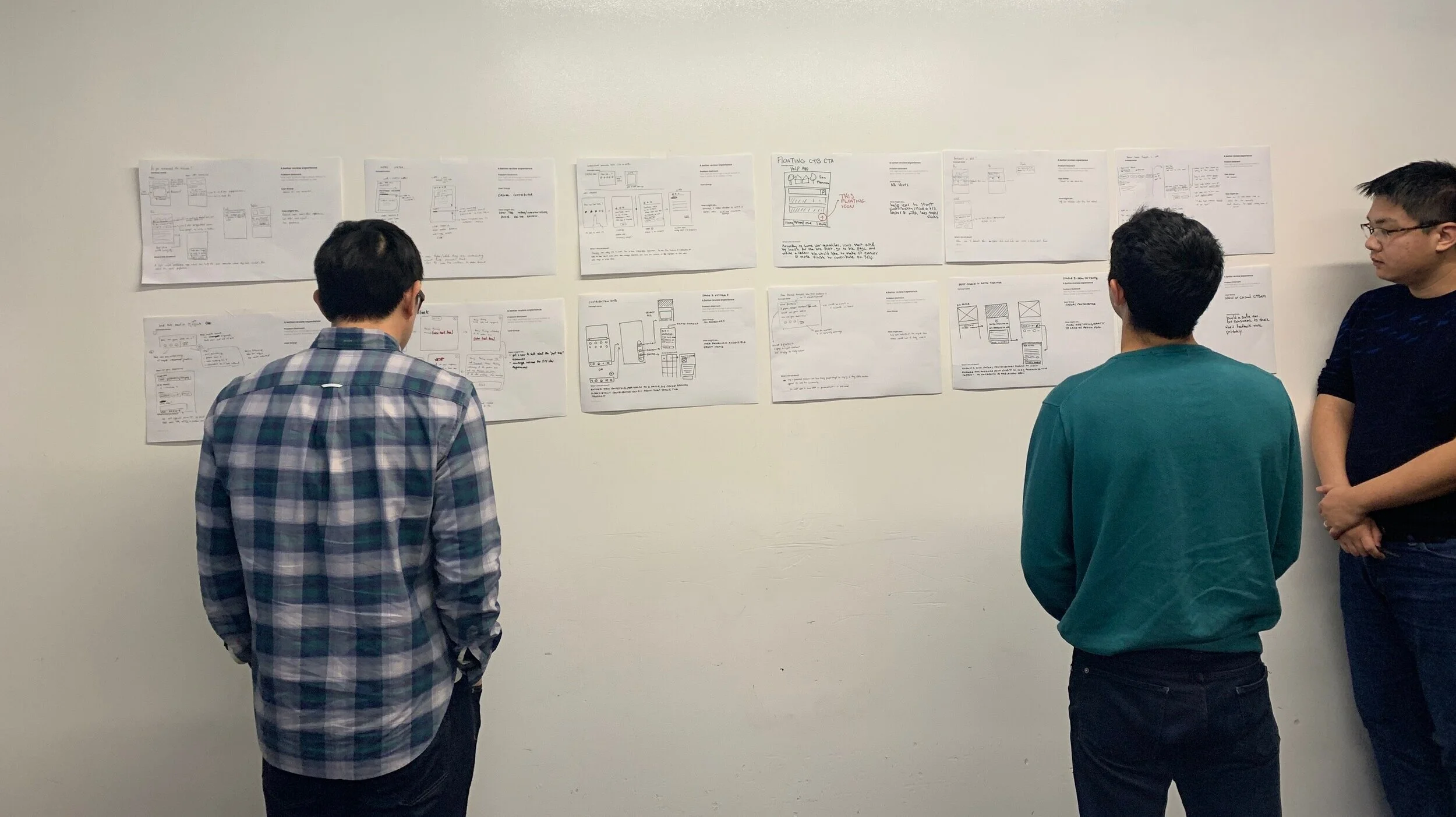
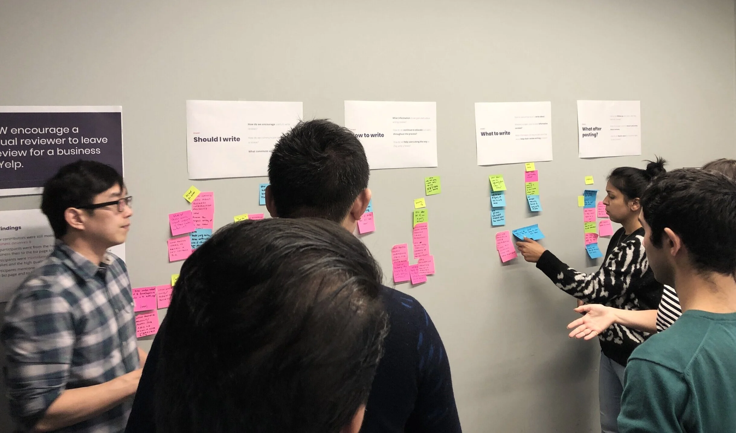
Now that we had some user pain points, the next step was to think about the potential opportunities we could focus on. I organized a workshop for my team to collaborate and come up with some possible solutions. This session included designers, product managers, engineers, and engineering managers.
After narrowing, we focused on these opportunities…
How might we encourage users to write a review?
How might we reduce the intimidation factor of writing a review?
How might we make the review writing process easier for casual users?
Step 3. Decide
At the end of the first day of ideation the group dot voted on the top ideas that were both impactful and feasible. Then, in order to get alignment we presented the top ideas to our stakeholders. From the stakeholder feedback we were able to find a focus area for the rest of the ideation.
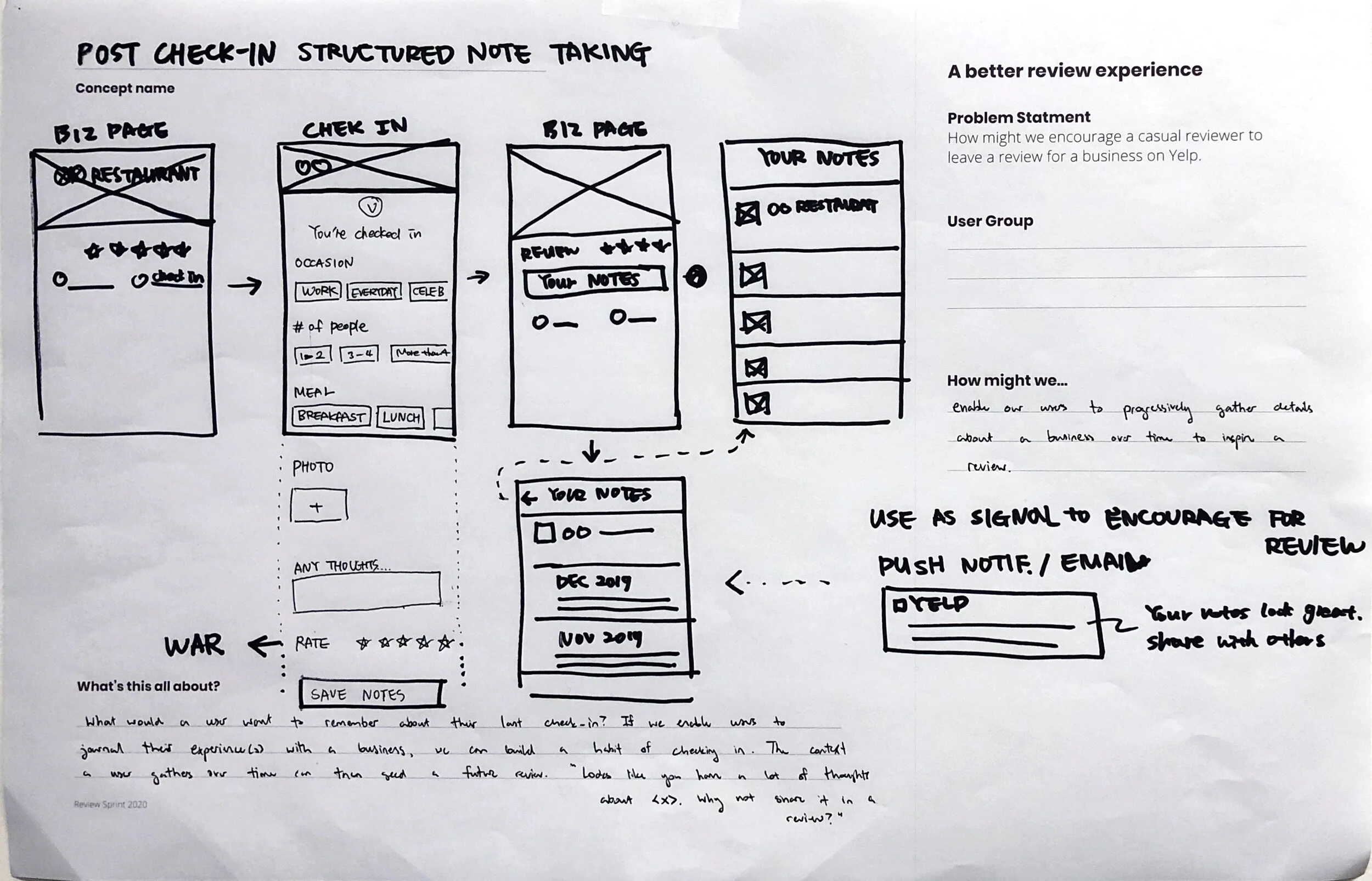
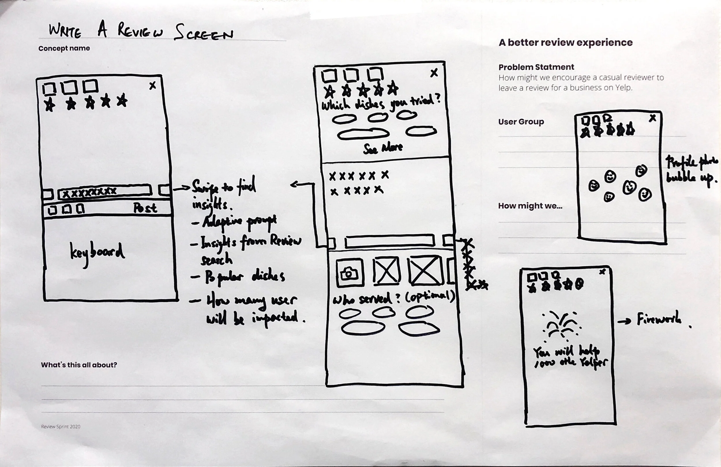
The next day we created a storyboard of the flow so we could better understand the prototype we wanted to build and test. My fellow designer and I sketched out the flow and starting thinking about the screen transitions.


Step 4. Prototype
Once our storyboard and user flow were created my teammate and I began working in Figma to bring our wireframes to life. We worked together to map out the screens in the flow, checking in frequently with our stakeholders to get feedback.
With some back and forth with our stakeholders, we thought it would be good to establish some principles for our designs. We came up with:
1. Investment Low-effort questions up front that will make users more invested in review writing later.
2. Conversation starters Ease casual contributors into review writing with topic suggestions and conversational language.
Step 5. Test

For the final step, we wanted to validate and test our design prototype. My fellow designer and I created a prototype that we tested in person with casual contributors.
Our hypotheses for the research were:
1. By getting users to agree/disagree up front, they will be more interested in providing their feedback about a business
2. By asking lightweight questions first, it will help the users with their final review flow
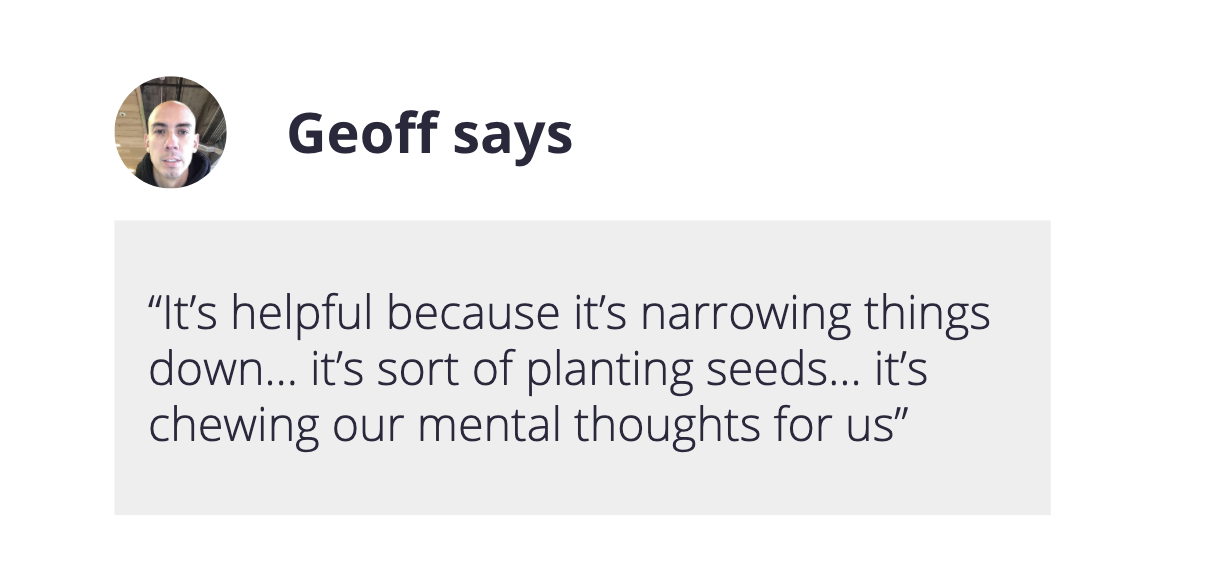
We used a usability scale for each participant to rank the prototype based on these factors:
Tier 1: Helpfulness & investment/review motivation
Tier 2: Delight (Satisfaction/happiness)